From bad to ugly…the very worst kits that have graced Premier League turf over the past 20 or so years
Uninspired? A mockery? Lazy? Tasteless? Thoughtless? If anyone knows the reason why some of the country’s finest clubs have graced the field in some horrendous kits during the Premier League era, let us know in the comments box below, because it is certainly baffling.
Perhaps the first that comes to mind is Norwich City’s migraine-causing home kit of 1992-4, but, believe it or not, there’s something more head pounding than the Canaries kit of 22 years ago, and that’s trying to compose the order of the Premier League’s 10 worst Premier League kits.
It’s worrying to think that Manchester United have agreed a 10-year deal with Adidas, after ending their long-term partnership with Nike. Who knows what horror kits the German sportswear giants have in store. Although, the cool £750 million they’ll earn from the deal will help to ease such thoughts, no doubt.
But here it is, after some deliberation it’s fair to say everyone will have their own take (and taste) of what is truly the most outrageous kit to be worn in the Premier League. However, unbelievably, there is so many to chose from, it was impossible to include them all.
Perhaps in another 10/ 20 years time we will laugh at the current kits in the Premier League, but surely fashion and trends will not change so significantly that any of this season’s kits could top any of these pieces of ‘art deco’?
Tottenham 2007/08 – Home ‘anniversary’ kit
 Hint for all sports brands, if you don’t want to completely ruin a club’s anniversary, then perhaps put a little more thought into their ‘anniversary’ home kit. Ok, perhaps the north Londoners will have had kits worse in the past and worse still to come, but adding a touch of (sky?) blue when they naturally play in white, is probably not the best of ideas.
However, at least the shirt matched their season. Average. Tottenham finished 11th, five places short of Aston Villa – who had earned a 4-4 draw against the north Londoners that campaign. Hopefully Under Armour will continue to do a better job than Puma did with this one!
Liverpool 2013/14 – Third kit
 It’s a shame that the Reds narrowly missed out a first league title in the Premier League era to Manchester City, but not so much of a shame that they were able to ditch their third kit that would have done little to inspire Luis Suarez and co.
Luckily the Uruguayan didn’t need inspiring, as he went on to win the Premier League Golden Boot and Player of the Year awards, while it was also a fine campaign for both Daniel Sturridge and Raheem Sterling, also.
Ok, as third kits go, they very rarely represent anything of the club, colour wise anyway, but purple, white and black? Someone must have spiked the kit designer’s cornflakes the morning that this kit was designed.
Blackburn Rovers 1996/97 – Away kit
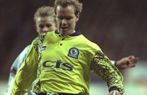 Only one thing is currently worse than Rovers’ away kit of 21 years ago, and that’s their current position in the Championship.
Overly-decorated sleeves are met with a blinding yellow body – it’s safe to say the opposition saw them coming.
Manchester United 1992/93 – Away kit
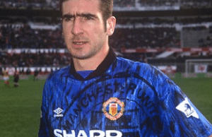 Just incase Red Devils fans forgot who they supported, a superimposed United badge was printed onto a black and blue stained Umbro shirt.
Far from subtle and rather tasteless, it would be wrong to deny an appeal of why this kit is just seventh in this list of 10 worst Premier League kits. Mind, they at least they had some decent players donning the kit.
Norwich City 1992/94 – Home kit
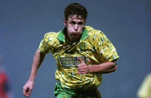 Ahh, here we are! No doubt one of the first kits many Premier League fans think of when identifying a horrendous kit worn in England’s top flight. There’s almost no other way to describe this than hectic. A mix of yellow, green and white – keeping to the club’s colour scheme, at least – their kit made the Canaries players look like they had been doing a painting job before getting to work on the pitch.
Unfortunately for Norwich, they were stuck with this kit for two seasons. Perhaps this is why us football fans are spending £40/50 for a kit every season! At least this avoid fans being stuck with a dodgy shirt for too long – if you’re mad enough to buy it in the first place, that is.
Coventry City 1992/93 – Home kit
 Their maiden season in the Premier League was pretty awful where their kits were concerned. Both home and away, City were far from visually appealing.
Considering the cold and wet winters in England, this rather summery looking kit looks rather out of place.
Still… it doesn’t seem like Coventry will be brining any atrocious kits into the Premier League any time soon.
Arsenal 1991/93 – Away kit
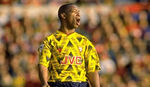
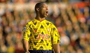 The Gunners have had some decent yellow away kits in recent years, however, their 1991/93 edition was not one of them.
The zig-zag pattern resembled something more of the patterns of the interior of a bus. And even their badge didn’t show up too well, either.
Nottingham Forest 1995/97 – Away kit
 Tragic is probably the best way to describe this kit, as the Premier League’s worst kits are coming to the fore. A crazy pattern on each side of the shirt, with black and yellow striped collar to top it off – this kit really was a sign of a hazard.
And again, another fated club who were stuck with their horrid kit for more than just a single season.
Aston Villa 1993/95 – Away kit
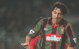 Perhaps a team of the late 1800s would have got away with this but, 100 years on, this kit was far from acceptable – even for football’s worst-dressed players.
Something you would expect to find in an antique shop, the black and green stripes were not only a baffling and off-putting choice of colours, but the hints of red took it from horrendous to horrific.
And just like last season for the Villans, this is one to leave in the past.
Middlesbrough 1996/97 – Away kit
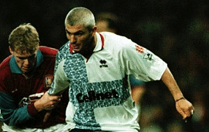 You could argue this kit is more wearable than Villas, but completely baffling and horrendous is what it was. A bizarre and unidentifiable pattern down the right side of the chest and across the torso, on a plain white shirt, make for a basic and ill thought through design.
It would be incredible to think that fans bought this, but it’s inevitable that supporters did. It would be intriguing to know what they’ve done with them since (they gained some sense of style). Nonetheless, Boro are back in the big time, luckily, with a vastly-improved away kit.
Perhaps the lesson to be learned from this is that less really is more.
Table of Contents

